This is a tutorial on using matplotlib.pyplot to create data visualizations. Here, we will be using the Palmer penguins dataset, which we import below.
Data Preparation
import pandas as pd#import spreadsheet of data as a Pandas dataseturl ="https://raw.githubusercontent.com/PhilChodrow/PIC16B/master/datasets/palmer_penguins.csv"penguins = pd.read_csv(url)penguins.head()
studyName
Sample Number
Species
Region
Island
Stage
Individual ID
Clutch Completion
Date Egg
Culmen Length (mm)
Culmen Depth (mm)
Flipper Length (mm)
Body Mass (g)
Sex
Delta 15 N (o/oo)
Delta 13 C (o/oo)
Comments
0
PAL0708
1
Adelie Penguin (Pygoscelis adeliae)
Anvers
Torgersen
Adult, 1 Egg Stage
N1A1
Yes
11/11/07
39.1
18.7
181.0
3750.0
MALE
NaN
NaN
Not enough blood for isotopes.
1
PAL0708
2
Adelie Penguin (Pygoscelis adeliae)
Anvers
Torgersen
Adult, 1 Egg Stage
N1A2
Yes
11/11/07
39.5
17.4
186.0
3800.0
FEMALE
8.94956
-24.69454
NaN
2
PAL0708
3
Adelie Penguin (Pygoscelis adeliae)
Anvers
Torgersen
Adult, 1 Egg Stage
N2A1
Yes
11/16/07
40.3
18.0
195.0
3250.0
FEMALE
8.36821
-25.33302
NaN
3
PAL0708
4
Adelie Penguin (Pygoscelis adeliae)
Anvers
Torgersen
Adult, 1 Egg Stage
N2A2
Yes
11/16/07
NaN
NaN
NaN
NaN
NaN
NaN
NaN
Adult not sampled.
4
PAL0708
5
Adelie Penguin (Pygoscelis adeliae)
Anvers
Torgersen
Adult, 1 Egg Stage
N3A1
Yes
11/16/07
36.7
19.3
193.0
3450.0
FEMALE
8.76651
-25.32426
NaN
We want to see whether there is a correlation between species, culmen length, and culmen depth. We won’t be using all of this data, so let’s extract only the columns we need. While we’re at it we can clean up the data by dropping rows with incomplete entries.
from matplotlib import pyplot as pltfig,ax = plt.subplots(1) #creates figure and axis to plot on
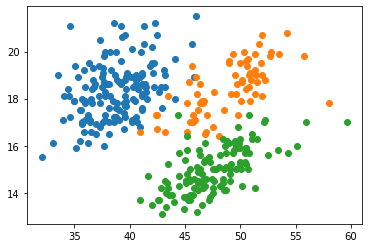
We want to plot culmen length against culmen depth, but we also need some way to differentiate between species. There are multiple way to do this, but here we use the groupby() function to split the dataset by species and plot each subset one by one. Each subset and associated species name can be iterated through, and the scatter() function automatically plots them in different colors.
for name, group in penguins.groupby("Species"): ax.scatter(data=group,x="Culmen Length (mm)",y="Culmen Depth (mm)",label=name.split()[0])fig
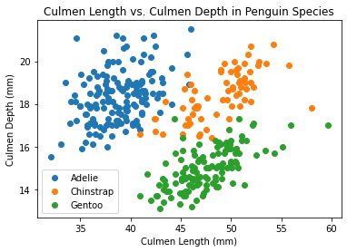
You’ll notice that we gave scatter() a label argument that takes the first word of the “Species” column. This is for the legend, which we add below along with axis labels and an title.
ax.set(xlabel="Culmen Length (mm)",ylabel="Culmen Depth (mm)",title="Culmen Length vs. Culmen Depth in Penguin Species")ax.legend()fig
From this data visualization we can see a pretty clear correlation between culmen length and depth with respect to species!